Fonts:
Heading font is Source Serif.
Body font is Source Sans
Heading 1 (H1)
Heading 2 (H2)
Heading 3 (H3)
Heading 4 (H4)
Heading 5 (H5)
Heading 6 (H6)
Normal paragraph text Nulla vitae elit libero, a pharetra augue. Cras justo odio, dapibus ac facilisis in, egestas eget quam. Nullam quis risus eget urna mollis ornare vel eu leo. Aenean lacinia bibendum nulla sed consectetur. Curabitur blandit tempus porttitor. Nulla vitae elit libero, a pharetra augue. Integer posuere erat a ante venenatis dapibus posuere velit aliquet.
Lead paragraph text that can be used as the intro for some pages. Fusce dapibus, tellus ac cursus commodo, tortor mauris condimentum nibh.
Important:
Don’t use the different Heading numbers in order to get a particular font size. You don’t ever need to add another H1 to a page as the title will automatically use it and you only have one H1 per page.
The next level of subtitles will be H2s and if they are broken into subsections themselves they will be H3 – it’s important for SEO and accessibility to stick to that hierarchy.
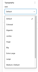
You can change the size of text with this dropdown
Primary colour is navy
Secondary colour is grey/blue
Tertiary colour is gold
Dark colour is the off-black used for text
The background colour is the one called ‘Light’
Buttons
You can choose whatever colours you like, but it’s best to stick to these two combinations.
Groups / Coloured background examples
Title goes here
Nulla vitae elit libero, a pharetra augue. Cras justo odio, dapibus ac facilisis in, egestas eget quam. Nullam quis risus eget urna mollis ornare vel eu leo. Aenean lacinia bibendum nulla sed consectetur. Curabitur blandit tempus porttitor. Nulla vitae elit libero, a pharetra augue. Integer posuere erat a ante venenatis dapibus posuere velit aliquet.
Separators
Spacers
You can’t see these visually but they’re an important block for layout building. By default, you add a Spacer block then choose its height by inputting a px height or by dragging and stretching it. The problem with that is that it’s not very mobile-friendly as the height is fixed across all screens. So a 80px spacer might look good on desktops but would be too big on a mobile. For that reason it is better to use one of my preset ones – S,M,L,XL instead as they are more ‘responsive’ to device sizes.
Default one (starts at 100px)
Small
Medium
Large
XL
Quotes
Duis mollis, est non commodo luctus, nisi erat porttitor ligula, eget lacinia odio sem nec elit. Maecenas sed diam eget risus varius blandit sit amet non magna.
Said by someone once
Philanthropy drives social innovation, environmental innovation and sustainable innovation. But its purest intention is to find ways of making the world a better place by supporting those who can drive change.
Widths
Many blocks have this ‘align’ setting which allows you to set the width to either ‘None‘ (which is the standard content width), Wide or Full. The wide width is used a lot for creating layouts.
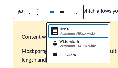
Content (aka ‘None’) width
Most paragraphs should stick this default content width because that’s best for line-length and readability.
Integer posuere erat a ante venenatis dapibus posuere velit aliquet. Nulla vitae elit libero, a pharetra augue. Aenean lacinia bibendum nulla sed consectetur.
Wide width
Some elements can be selected for ‘Wide’ width – which is useful for things that have columns in for example. Avoid letting paragraphs of text run to this wide width though as the line-length can be too long t be read comfortably.
Integer posuere erat a ante venenatis dapibus posuere velit aliquet. Nulla vitae elit libero, a pharetra augue. Aenean lacinia bibendum nulla sed consectetur.
Full width
You’d only select this to create blocks of background colour. Use it sparingly as it can mess up the formatting of other blocks placed inside it.
Use colours sensibly!
Just because you can create different background and text colour combinations, it doesn’t mean you should. Text should only ever be white or dark. Coloured text on a coloured background always looks a bit naff.
Media & Text block
Title here
These are a really useful type of block. you can have the image on the right or left and can change the width of the image.
Experiment with the ‘crop image to fill column’ setting – I usually turn that on for photos.
Lists
Default
- Donec ullamcorper nulla non metus auctor fringilla. Vestibulum id ligula porta felis euismod semper. Maecenas faucibus mollis interdum. Donec id elit non mi porta gravida at eget metus.
- Etiam porta sem malesuada magna mollis euismod. Fusce dapibus, tellus ac cursus commodo, tortor mauris condimentum nibh,
- Praesent commodo cursus magna, vel scelerisque nisl consectetur et. Praesent commodo cursus magna, vel scelerisque nisl consectetur et.
- Morbi leo risus, porta ac consectetur ac, vestibulum at eros. Aenean lacinia bibendum nulla sed consectetur.
Large bullets
- Donec ullamcorper nulla non metus auctor fringilla. Vestibulum id ligula porta felis euismod semper. Maecenas faucibus mollis interdum. Donec id elit non mi porta gravida at eget metus.
- Etiam porta sem malesuada magna mollis euismod. Fusce dapibus, tellus ac cursus commodo, tortor mauris condimentum nibh,
- Praesent commodo cursus magna, vel scelerisque nisl consectetur et. Praesent commodo cursus magna, vel scelerisque nisl consectetur et.
- Morbi leo risus, porta ac consectetur ac, vestibulum at eros. Aenean lacinia bibendum nulla sed consectetur.
Chevron list (used mainly for links)
- Donec ullamcorper nulla non metus auctor fringilla.
- Etiam porta sem malesuada magna mollis euismod.
- Praesent commodo cursus magna, vel scelerisque nisl consectetur et.
- Morbi leo risus, porta ac consectetur ac, vestibulum at eros.
Large numbers ordered list
- Donec ullamcorper nulla non metus auctor fringilla. Vestibulum id ligula porta felis euismod semper. Maecenas faucibus mollis interdum. Donec id elit non mi porta gravida at eget metus.
- Etiam porta sem malesuada magna mollis euismod. Fusce dapibus, tellus ac cursus commodo, tortor mauris condimentum nibh,
- Praesent commodo cursus magna, vel scelerisque nisl consectetur et. Praesent commodo cursus magna, vel scelerisque nisl consectetur et.
- Morbi leo risus, porta ac consectetur ac, vestibulum at eros. Aenean lacinia bibendum nulla sed consectetur.
Group blocks
Using Groups is the key to building page layouts. The easiest thing is to create your text or content first, then select it all and Group it:

Once you have a Group, it is common to give it a background colour (and change the text and link colour to white if need be). You can also select some Styles as well:
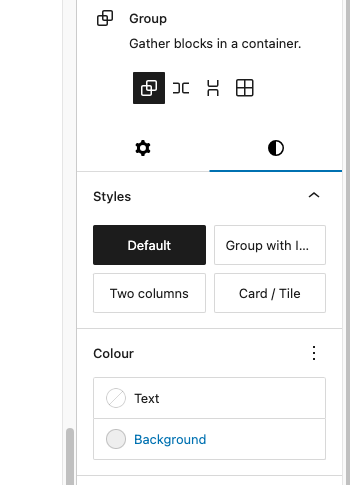
Default Group block
Nulla vitae elit libero, a pharetra augue. Nullam quis risus eget urna mollis ornare vel eu leo. Donec sed odio dui. Curabitur blandit tempus porttitor. Nullam quis risus eget urna mollis ornare vel eu leo. Lorem ipsum dolor sit amet, consectetur adipiscing elit.
Group with icon
Nulla vitae elit libero, a pharetra augue. Nullam quis risus eget urna mollis ornare vel eu leo. Donec sed odio dui. Curabitur blandit tempus porttitor. Nullam quis risus eget urna mollis ornare vel eu leo. Lorem ipsum dolor sit amet, consectetur adipiscing elit.
Blocks that you add into content pages
External links block
You can change the colour of this
Recommended reading
Example site 1
This is another example site
This one has a bit of a description as to what it is all about
Related pages box
You can change the colour of this
This is one you might put at the end of a page
Related pages/posts
This block has multiple options all within the same block – so you can switch the layout at any time. You can select from blog posts, pages, philanthropy stories and reports (and a mixture if need be). You can either select them manually or have it pulled in automatically by the category (only blog posts have categories though). Plus you can switch between a ‘card’ layout and an ‘inline’ layout that takes up a bit less room.
Manually selected – cards layout
Related pages
Elite philanthropy – academic study vs real world practice
Giving effectively: can data play a bigger role in decision-making?
Good News? Can philanthropy unlock a better media landscape?
How Better Data on HNW Giving can sustain Giving Trends
Manually selected – cards layout, wider version, with excerpts
Related pages
Elite philanthropy – academic study vs real world practice
Last month – February 2021 -new research was published suggesting that “giving by the super-rich could be perpetuating social inequality.” The study is an important…
Giving effectively: can data play a bigger role in decision-making?
Determining what charitable causes you want to support is quickly followed by the problem of resource allocation. But this can be tough when the third…
Good News? Can philanthropy unlock a better media landscape?
Fake news, propaganda, corruption. Elements found far too often in the UK media. But can hope be found in an unlikely ally? Jonathan Heawood, director…
How Better Data on HNW Giving can sustain Giving Trends
Beacon has been tracking giving in the UK’s millionaire population since the start of Covid. The most recent results, our 7th survey, provide the opportunity…
Manually selected – text layout
Related pages
From a category – cards layout
Related pages
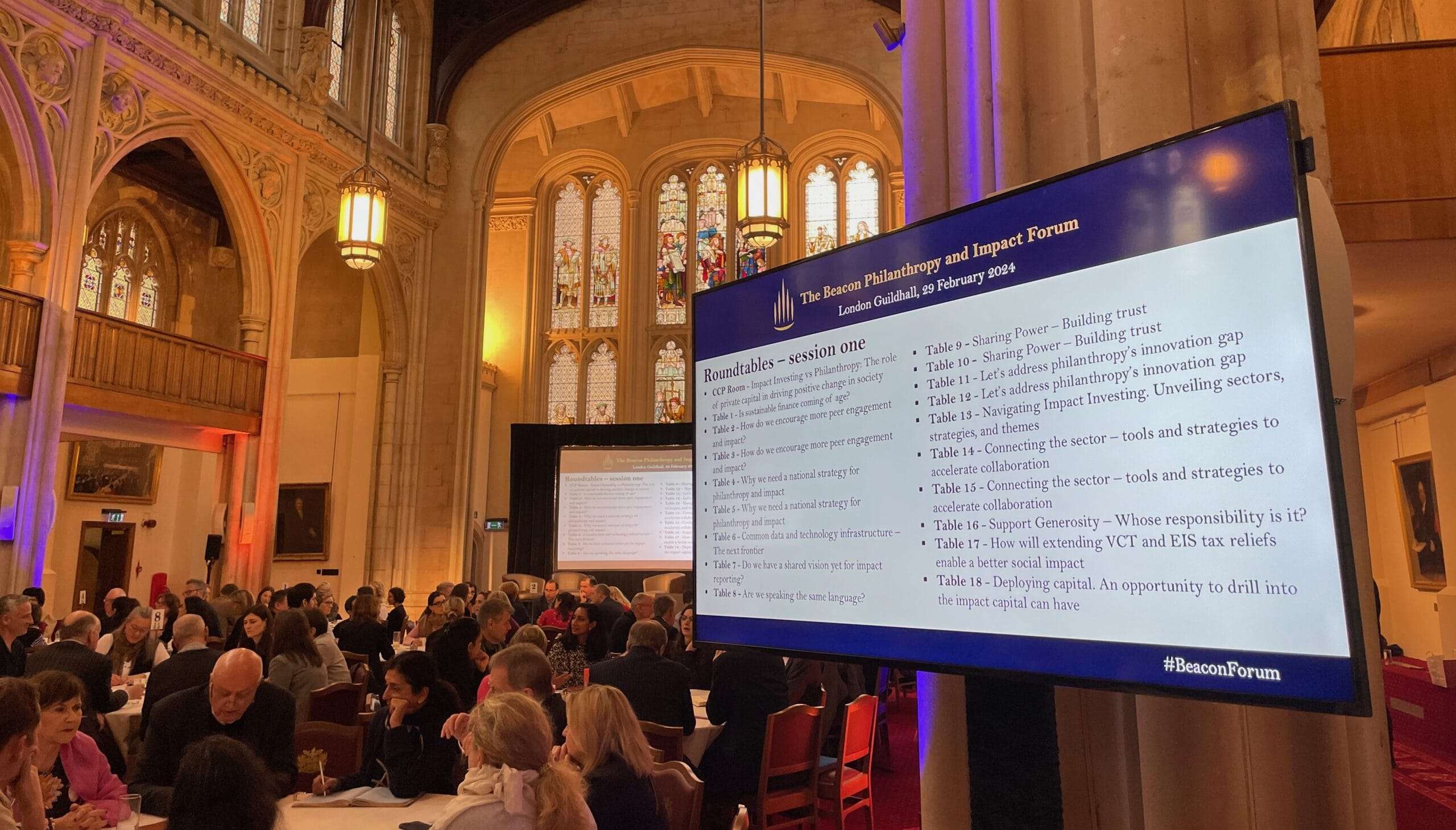
Beacon Impact Forum: Convening charities, government, the private sector and the philanthropy sector to grow giving and charities
We’re making good progress — but what should come next?
Raising the stakes — researching the scale and potential of high net worth philanthropy

Cultivating Generosity: The money coach: Shifting your wealth from worry to wellbeing

Foundation Practice Rating: philanthropy and public accountability
The Philanthropy Ecosystem: Giving vehicle providers
The Philanthropy Ecosystem: Private Client Advisors
The Philanthropy Ecosystem: Thinkers, researchers, academics

The Philanthropy Ecosystem: What is a philanthropy advisor and what do they do?
From a category – text layout
Related pages
- Beacon Impact Forum: Convening charities, government, the private sector and the philanthropy sector to grow giving and charities
- We’re making good progress — but what should come next?
- Raising the stakes — researching the scale and potential of high net worth philanthropy
- Cultivating Generosity: The money coach: Shifting your wealth from worry to wellbeing
- The Philanthropy Ecosystem: Donor educators
- Foundation Practice Rating: philanthropy and public accountability
- The Philanthropy Ecosystem: Giving vehicle providers
- The Philanthropy Ecosystem: The Connectors
- The Philanthropy Ecosystem: Private Client Advisors
- The Philanthropy Ecosystem: Thinkers, researchers, academics
- The Philanthropy Ecosystem: What is a philanthropy advisor and what do they do?
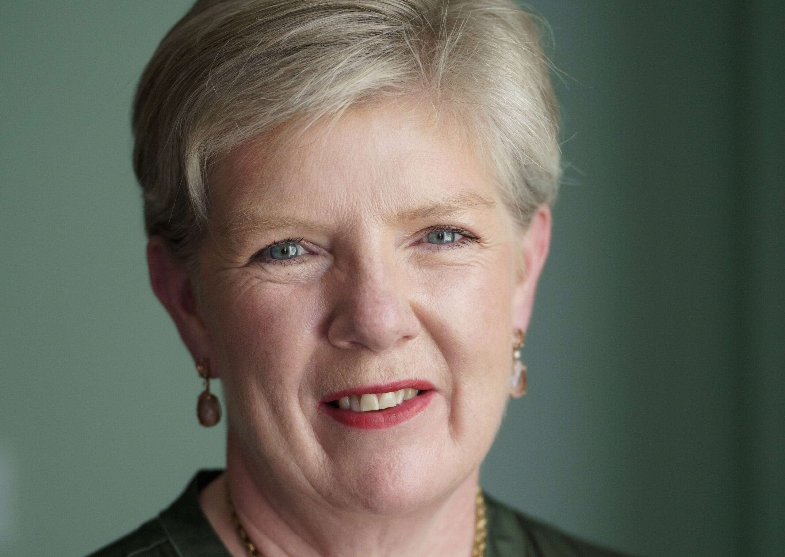
Author bio box
Most likely placed at the bottom of a blog post. If the author writes multiple blogs you could insert it once and save it as a ‘pattern’ so you can quickly add it into other posts.

Cath Dovey
Co-founder, The Beacon Collaborative
Cath is a co-founder of the Beacon Collaborative and is the lead coordinator for a number of the activities. Formerly a co-founder of Scorpio Partnership, the global wealth management strategy and research firm, she led the firm’s high-net-worth and strategy research capabilities for two decades. In the field of philanthropy, Cath headed Scorpio Partnership’s global research work with major donors, family givers and family foundations. Cath chairs Rosa, the UK fund for women and girls, and is a trustee of Philanthropy Impact.
Report download block

Bridging diversity in British giving: Engaging donors from diverse giving communities
Author(s)
The Beacon Collaborative
Year